
When homeowners in Gatineau, Hull, Aylmer QC, Chelsea QC, or Rockcliffe ON decide to remodel their bathrooms in 2025, one of the most influential decisions they make is the colour palette. Colour affects mood, perceived space, light reflection, and the overall personality of the room. Especially during our long winters and relatively short summers, the right colours can make a bathroom feel brighter, warmer, more spa-like, or more luxurious—even if the space is modest in size.
In 2025, trends are shifting in ways that reflect broader tastes: people want bathrooms that are calm, natural, balanced, and timeless—but with moments of character. Gone (at least temporarily) are the days of loud, overly busy patterns; now, subtlety, harmony, and mood matter most. Whether you have a compact 5×10 bath or a roomy ensuite, the right palette can transform the experience.
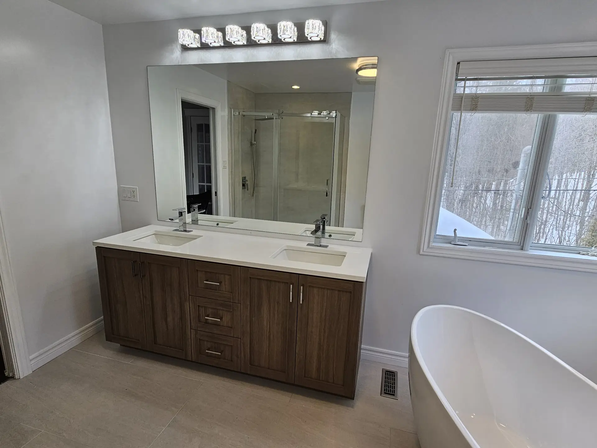
This article walks you through the leading 2025 bathroom colour trends taking over Gatineau remodels, why they work, how to apply them, and how to combine them with materials, lighting, and fixtures for a space that feels modern, welcoming, and built to last.
Top Bathroom Colour Trends for 2025
1. Soft Stone & Warm Greige
What it looks like: gentle greys with warm undertones; soft greige that bridges grey and beige; stone-inspired neutrals like sandstone, light taupe, or warm pebble tones.
Why it’s trending:
- It plays beautifully with natural and artificial light — in north-facing Gatineau bathrooms with small windows, soft greige reflects enough light to feel bright and open.
- It acts as a timeless neutral backdrop, allowing fixtures and accents (black hardware, wood vanities, greenery) to stand out.
- It pairs well with a variety of textures — matte porcelain tile, faux concrete, wood-look flooring — giving versatility in finishes without overwhelming the space.
How to apply it:
- Paint walls in a soft greige, then use light stone-look porcelain tile on floors/shower.
- For larger spaces: consider greige floor tiles + crisp white subway-wall tile for a clean, layered look.
- Add warmth with wood or rattan accents (vanity, shelving, bath tray).
Result: You get a bathroom that feels modern, calm, slightly upscale — and won’t date quickly.
2. Muted Sage & Nature-Inspired Green
What it looks like: soft, muted greens — think sage, eucalyptus, pale olive — often mixed with off-whites, warm greige or natural wood tones.
Why it’s trending:
- People are drawn to nature-inspired palettes after busy city lives; this colour evokes calm, forest-like serenity.
- Green works surprisingly well even in bathrooms with limited light, especially when paired with good lighting and reflective surfaces.
- It pairs beautifully with natural textures: wood vanities, stone-style tiles, matte fixtures — offering a spa-like, organic vibe.
How to apply it:
- Use muted sage paint on one wall (feature wall), keep other walls neutral.
- Consider green-toned hex or subway tile for shower niches or backsplash.
- Pair with matte black or brushed brass fixtures for a modern/natural contrast.
- Use plants (real or faux) to reinforce the nature-inspired theme.
Result: The bathroom becomes a soft, tranquil retreat — ideal after long winters, and especially appealing for homebuyers seeking calm, natural spaces.
3. Warm White & Cream with Textured Accents
What it looks like: warm off-white or creamy tones on walls and ceilings, with textured accent elements — such as matte tile, stone-look surfaces, or patterned mosaics.
Why it’s trending:
- Warm whites avoid the sterile “hospital” look that harsh whites sometimes bring; they feel homey and inviting.
- The neutral base gives flexibility — you can easily update fixtures, towels, décor — without redoing the whole room.
- Textured accents break the monotony, add depth and visual interest, yet maintain overall lightness.
How to apply it:
- Paint walls & ceiling in a warm white or soft cream.
- Use large-format floor tile in stone-look or light texture.
- Add a textured accent — for example, a shower wall in gentle pattern tile or a mosaic strip above the vanity.
- Complement with wood or matte black accents, soft towels, minimalist lighting.
Result: A classic bathroom that feels bright, clean, and timeless — easy to personalize over time.
4. Soft Charcoal & Matte Black Contrast (Used Sparingly)
What it looks like: deep charcoal or soft dark grey combined with matte black fixtures — but always balanced with light surfaces (white tile, light walls, airy glass).
Why it’s trending:
- Dark tones add elegance, drama, and sophistication without sacrificing modern minimalism.
- When used sparingly and balanced, darker shades create depth and make whites and lights “pop.”
- Black or dark fixtures are increasingly popular for their bold, contemporary statement and versatility with many tile and paint choices.
How to apply it without overwhelming the space:
- Use dark tile or paint for a single accent wall (e.g. vanity wall or shower wall), keep the rest light.
- Use matte black showerheads, faucets, towel bars, mirror frames for contrast.
- Consider a floating vanity in dark finish but with a light countertop and bright mirror lighting.
- Maintain good lighting (warm LED, sconces) and glass shower enclosure for openness.
Result: A small bathroom with a modern-yet-cozy edge; dramatic but balanced, bold yet airy.
5. Subtle Earthy Clay & Terracotta Undertones
What it looks like: muted clay, soft terracotta, dusty terra tones, or sandy peach — always in subtle, pastel-inspired shades rather than bold brick red.
Why it’s trending:
- Provides warmth and softness — nice during long winters in Gatineau.
- Pairs beautifully with wood accents, neutral tile, woven baskets, soft textiles — creating a “warm Scandinavian” or “Mediterranean minimal” feel.
- Offers a gentle throwback to vintage styles without looking outdated when used subtly.
How to apply it:
- Use clay-toned grout lines between light tiles for subtle warmth.
- Use terracotta-toned tiles for floor or a small accent wall, paired with neutral walls.
- Add natural wood shelving, beige towels, woven baskets, soft lighting to complete the tone.
Result: The bathroom feels welcoming, serene, and slightly rustic — a departure from stark minimalism, without losing modern cleanliness.
Why These Trends Fit Gatineau & Surrounding Areas in 2025
- Climate & Natural Light: Long winters + overcast seasons demand colour schemes that maximize light — soft greiges, warm whites, muted greens help brighten spaces.
- Smaller, Older Houses: Many homes have compact bathrooms; these colour palettes make small spaces feel larger and more open.
- Growing Demand for Multifunctional Spaces: Bathrooms often double as personal spas or relaxation zones; these soft, neutral, nature-inspired palettes support relaxation and comfort.
- Desire for Timelessness + Flexibility: Neutral bases with subtle accents mean homeowners can update décor, fixtures, or accessories over time without needing a full renovation.
- Resale and Longevity: Neutral and softly modern palettes tend to stay appealing longer, improving resale appeal in the competitive Ottawa–Gatineau market.
How to Choose the Right Colour Palette for Your Bathroom Renovation
Here’s a simple decision framework to help pick the palette that works best for your space, lifestyle, and home.
| Step | Ask Yourself | What to Do Based on Your Answer |
|---|---|---|
| 1 | How much natural light does the bathroom get? | If limited → choose soft greige, warm white, or muted sage. If lots of light → you can explore darker accents or richer tones. |
| 2 | Will this be a “forever” renovation or a quick update? | Long-term → go with timeless neutrals (warm white, greige, light stone). Short-term or rental → consider more bold accents (charcoal, clay, muted green). |
| 3 | Is the bathroom large or compact? | Compact → use light neutrals + glass + large tiles. Large → you can afford more contrast, feature walls, accent colours. |
| 4 | What mood do you want daily? Spa-like? Clean & Modern? Warm & Cozy? | Spa → sage, stone, warm white. Clean/Modern → greige + black accents. Cozy → clay/terracotta + wood accents + warm lighting. |
| 5 | What existing fixtures/materials will stay? | Match or complement existing finishes (vanity, floor, countertop) to avoid clashes. |
| 6 | How much upkeep are you okay with? | For easy care → matte porcelain, neutral paint, minimal grout. For more texture/style → textured tile, grout contrast, natural stone (with sealing). |
Using this framework helps you make intentional, confident decisions — avoiding colour-buyers’ remorse or a mismatched bathroom that needs rework later.
Bringing It All Together: Sample 3 Trend-Based Bathroom Palettes for 2025
Palette A – “Scandinavian Spa Light”
- Walls: Soft warm white
- Floor: Large-format porcelain tile in light stone-grey
- Shower walls: Matte off-white subway tile
- Accents: Floating wooden vanity, matte black fixtures, frameless glass shower door
- Textiles & Décor: Light linen curtains, soft cream towels, potted greenery
Result: Open, airy, calming, easy to maintain — ideal for smaller bathrooms.
Palette B – “Muted Nature Retreat”
- Walls: Muted sage green
- Floor: Sandstone-effect porcelain tile
- Shower accent wall: Light greige large-format tile
- Accents: Brushed brass or copper fixtures, wood veneer vanity, woven storage baskets
- Décor: Earth-toned towels, bamboo bath mat, soft warm LED lighting
Result: Warm, natural, spa-like — a soft escape from daily life.
Palette C – “Modern Contrast Minimal”
- Walls: Warm greige
- Floor: Charcoal large-format tile
- Shower walls: Light stone-look tile
- Accents: Matte black hardware + flush glass shower panel
- Décor: Crisp white towels, minimal greenery, black-framed mirror
Result: Clean, modern, sharp — great for those who love contemporary design yet want a neutral base.
Common Mistakes & How to Avoid Them
Even with good intentions, colour mistakes happen. Here are common pitfalls and how to avoid them:
- Using too many bold colours at once → Stick to 1–2 accent colours maximum. Neutrals + 1 accent = clean, timeless design.
- Glossy floor tiles in wet zones → They look nice, but become slippery; prefer matte or textured finishes.
- Mismatched tones (warm vs cool) → Ensure all finishes (paint, tile, fixtures) share either warm or cool undertone to avoid clashes.
- Ignoring lighting when choosing paint → Always test paint swatches both in daylight and under artificial light before committing.
- Overlooking grout and seal maintenance → Light tiles with dark grout can look busy; darker grout on light tiles shows less staining if cleaned regularly.
Good planning reduces the risk of regrets — and avoids expensive rework later.
Conclusion
The 2025 bathroom colour trends sweeping through Gatineau, Hull, Aylmer QC, Chelsea QC, and Rockcliffe ON reflect a growing desire for spaces that are calm, natural, flexible, and timeless. From soft stone greige to muted sage green, warm clay, and modern charcoal accents — these palettes offer versatility, style, and practical comfort for a wide range of lifestyles.
Whether you’re renovating a small 5×10 bath or giving an ensuite a facelift, the right colour—combined with thoughtful tile, fixtures, lighting, and layout—can completely redefine how the space feels.
Take your time to choose, test carefully, and plan according to your light, space, and daily use. The result will be a bathroom that doesn’t just look good on opening day — but stays welcoming, stylish, and comfortable for years to come.
2025 – Tendances de Couleurs pour Salle de Bain: Ce qui Domine les Rénovations à Gatineau
Lors des rénovations de salles de bain en 2025 dans la région de Gatineau, Hull, Aylmer QC, Chelsea QC, et Rockcliffe ON, certaines palettes de couleurs s’imposent. Ces tendances visent à créer des espaces lumineux, apaisants, intemporels — des refuges de calme pour tous les jours.
Pourquoi la Couleur Est Capitale dans une Rénovation en 2025
La couleur influence tout : l’impression d’espace, l’ambiance, l’entretien, la lumière.
- Dans une région au climat contrasté (hivers longs, lumière limitée), des teintes bien choisies réchauffent la pièce.
- Dans de petites salles de bain typiques des maisons anciennes, les bonnes couleurs ouvrent l’espace visuellement.
- Pour une salle de bain qui dure dans le temps, la couleur doit être neutre, durable, facile à harmoniser avec différents styles.
Tendances Couleurs 2025
1. Pierre douce & Greige chaud
Palette pierreux doux, greige chaleureux, tons taupe clair.
- Ambiance moderne et sobre
- Très lumineuse, adaptée aux petits espaces
- S’intègre facilement avec bois, verre, métal
2. Sauge douce & verts inspirés de la nature
Palette nature : vert sauge, eucalyptus, olive pâle.
- Calme, relaxante, proche de la nature
- Parfait pour une ambiance type spa ou hygge
- Fonctionne bien avec bois, bambou, pierres naturelles
3. Blanc chaud & crème + accents texturés
Blanc cassé ou crème pour murs/plafond, accents texturés en carrelage.
- Lumineux, propre, intemporel
- Base neutre facile à rafraîchir
- Accents légers pour ambiance chic sans surcharge
4. Charbon doux & contraste noir mat (avec modération)
Gris foncé ou charbon + accessoires noirs mats + surfaces claires.
- Look contemporain, élégant, minimaliste
- Contraste fort qui valorise les détails
- Se combine bien avec carrelage clair et verre
5. Argile douce & tons terreux subtils
Teintes argileuses, terracotta douce, tons sable, terre cuite discrète.
- Ambiance chaleureuse, presque rustique
- Très confortable en hiver
- S’associe à bois, paniers, matériaux naturels
Pourquoi ces Tendances Marchent en 2025 dans la Région
- Besoin de lumière et chaleur en hiver
- Beaucoup de maisons avec salles de bain compactes — les bonnes couleurs agrandissent visuellement l’espace
- Tendance vers le bien-être à domicile, la détente, le style spa
- Recherche de durabilité, neutralité et valeur de revente
Comment Choisir la Palette Pour Votre Salle de Bain
- Vérifiez la lumière naturelle : si limitée → couleurs claires
- Pensez à la longévité : utilisez des teintes neutres si vous prévoyez de rester longtemps ou vendre
- Évaluez la taille : petite salle → couleurs claires + grands formats; grande salle → plus de contraste possible
- Définissez l’ambiance recherchée : moderne, naturelle, cosy, minimaliste, spa, etc.
- Vérifiez les matériaux existants : meubles, vanité, plancher — pour bien harmoniser
- Pensez à l’entretien : nuances claires + finitions mats = moins de traces et entretien plus simple
3 Palettes Prêtes à l’Emploi (Mood Boards)
A. “Scandinavian Spa Light”
- Murs : blanc chaud
- Sol : carrelage pierre clair
- Douche : tuiles blanche neutre
- Accents : bois clair, noir mat, verre transparent
B. “Retraite Nature Douce”
- Murs : sauge douce
- Sol : carrelage effet pierre sable
- Douche : greige doux
- Accents : cuivre ou laiton brossé, bois, lumière chaude
C. “Minimalisme Moderne Contrasté”
- Murs : greige chaud
- Sol : carrelage gris charbon
- Douche : pierre claire ou grise
- Accents : noir mat, verre, miroir minimaliste
Erreurs à Éviter & Conseils Pratiques
- Ne pas abuser des couleurs foncées : un accent suffit
- Éviter les carrelages brillants au sol de douche (glissance)
- Harmoniser les tons (neutre chaud ou neutre froid) pour éviter les conflits visuels
- Tester la peinture ou le carrelage sous lumière naturelle et artificielle
- Utiliser des joints résistants, bons scellants, matériaux antidérapants
Conclusion
En 2025, les rénovations de salles de bain à Gatineau, Aylmer QC, Hull, Chelsea QC et Rockcliffe ON adoptent des palettes de couleurs qui privilégient la calme, la lumière, la durabilité, et l’harmonie.
Que vous cherchiez une salle de bain lumineuse et minimaliste, un espace chaleureux et naturel, ou un luxe tranquille inspiré d’un spa — il existe une palette 2025 parfaitement adaptée à vos besoins.
Avec la bonne combinaison de couleurs, matériaux, éclairage et accessoires, votre salle de bain peut devenir un espace accueillant, moderne et intemporel — agréable à vivre et facile à revendre.
